Amplifying Trust &
Safety Impact
With a single platform that brings together data and context, Cinder acts as a command center for trust and safety teams. This information visibility allows teams to make accurate decisions quickly and best protect their users. With former experience on Meta’s trust and safety team, at Palantir, and in the US government and academia, Cinder’s team knows engineering, investigations, intelligence, and policy-making. Using Cinder, trust and safety teams can better understand their data, streamline decision making, and measure their effectiveness.
Brand Identity
Website Design
Website Development
Trust & Safety Command Center
We created a brand that acknowledges the challenges of the trust and safety teams doing incredibly difficult work, and that highlights for key decision makers how Cinder helps to measure outcomes of that work. We kept these audiences in mind as we built a system flexible enough for straightforward internal documents, and for strong branded moments that allude to the tactical nature of trust and safety teams.
Starting with brand strategy, we crafted a positioning with Cinder as the command center from which trust and safety teams can amplify their existing policies for maximum efficiency and impact. Having data and context together in one place increases transparency, power, and clarity of vision for decision making—the three core values we incorporated into Cinder’s strategy. With these guiding principles, we used the brand strategy to inform our subsequent brand identity and web design and development work.

Sleek
& Streamlined
With core visual concepts that built off our brand strategy work, we designed a sleek visual system to evoke the ways that Cinder can streamline processes for trust and safety teams. The logomark is pared back, inspired by Cinder’s ability to correctly and efficiently identify and address incidents within a larger context. In this way, its form gives a nod to the precision in decision making trust and safety teams have when using Cinder.
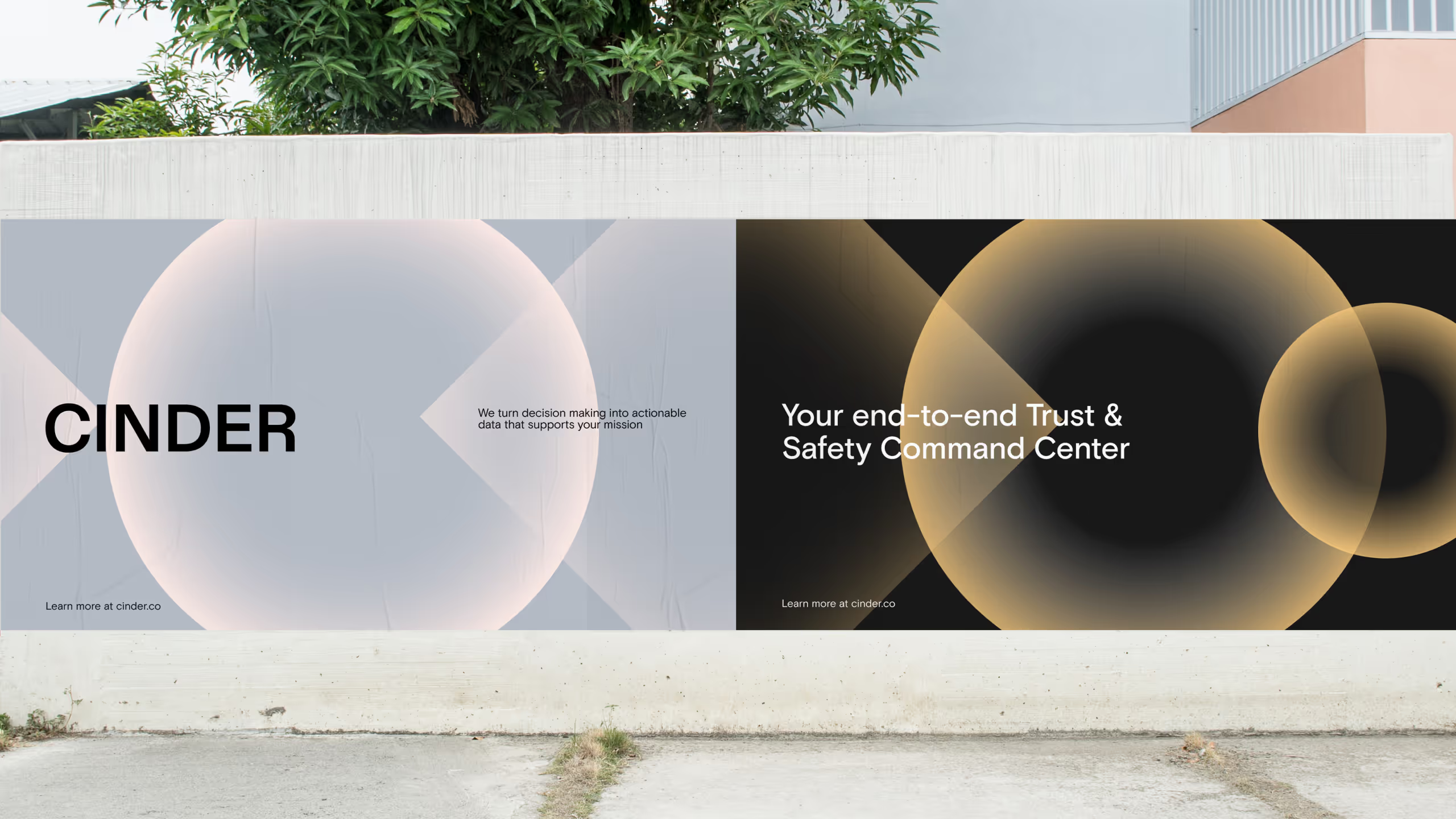
Beyond the mark, the core of the visual system is the gradient shape system. Designed with Cinder’s new core brand values of amplification, power, and transparency in mind, color radiates from each shape’s center. The radial gradient, paired with a tonally warm palette, gives the illusion of a glow when set against our primary dark neutrals.


Dynamic Precision
Transitioning into web design and development from our new brand work, we designed an elevated website that brings Cinder’s features to the fore. We also brought movement to the site through animation of the graphic shape system. In motion, the gradient shape system serves as a visual connection to how Cinder helps trust and safety teams illuminate information. And, when embedded in the streamlined web design, these animated shapes indicate how Cinder allows teams to be dynamic and efficient, all while remaining precise in execution.


